Create Style
What are we styling?
All
roblox
youtube
google
discord
spotify
pinterest
whatsapp
facebook
instagram
yandex
vk
twitter
netflix
pokemonshowdown
tumblr
openai
wikipedia
reddit
fandom
baidu
amazon
Most popular Wordpress Themes, Skins & Backgrounds
Style Wordpress with custom Wordpress themes! Change the background, color, schemes, fonts, and more! Share your own themes for Wordpress too!
Wordpress
3.9
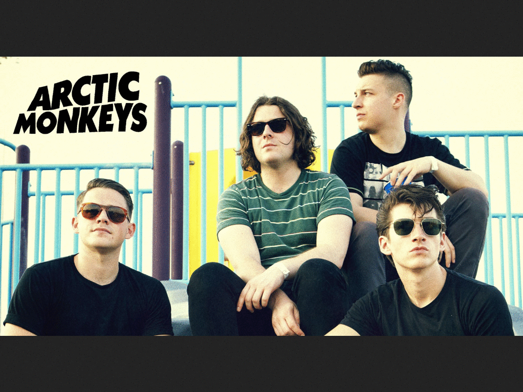
Arctic Monkeys The Death Ramps 2
0
Wordpress
3.9
Burst lolis translations anim
1
Wordpress
fix (unliquify) wordpress org homepage
0
Wordpress
Hide Wordpress.com Dashboard tips
5
Wordpress
Improve WordPress.com admin interface
0
Wordpress
Centrar Bay Harbor Butcher Blog
5
Wordpress
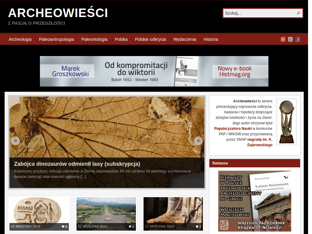
archeowiesci - czarne na białym
0
Wordpress
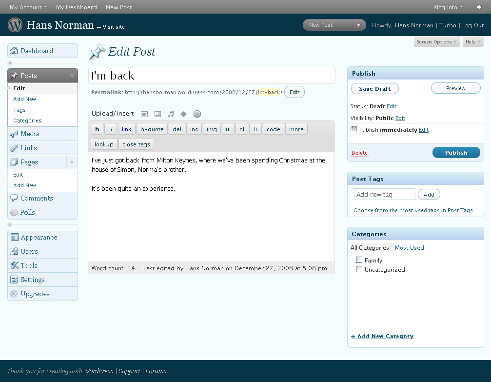
Wordpress Dashboard Font
0
Wordpress
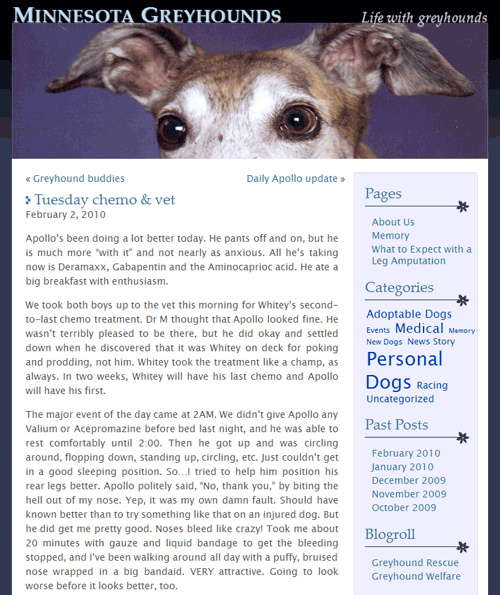
Minnesota Greyhound Rescue Blog
0
Wordpress
ContentsOnly: maclalala2
0
Wordpress
Wordpress admin - tahoma font for persian
0
Wordpress
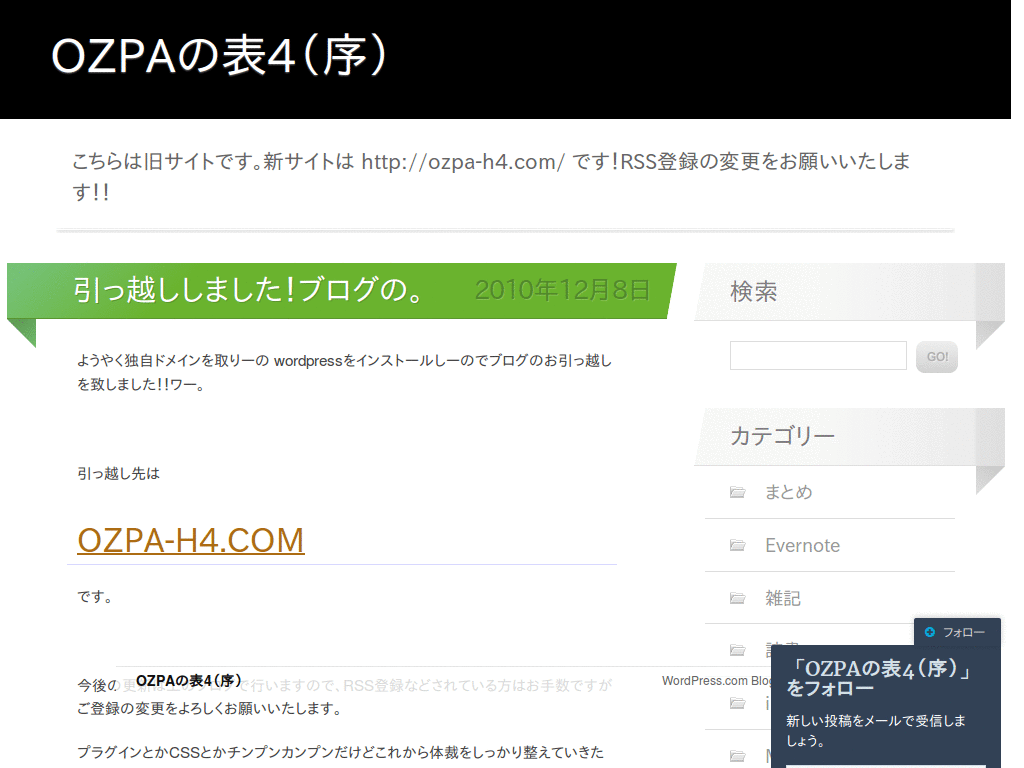
ContentsOnly: OZPA
0
Wordpress
Wordpress.com: Fixed Width Font
0
Wordpress
INove (wordpress theme) Dark Text
0
Wordpress
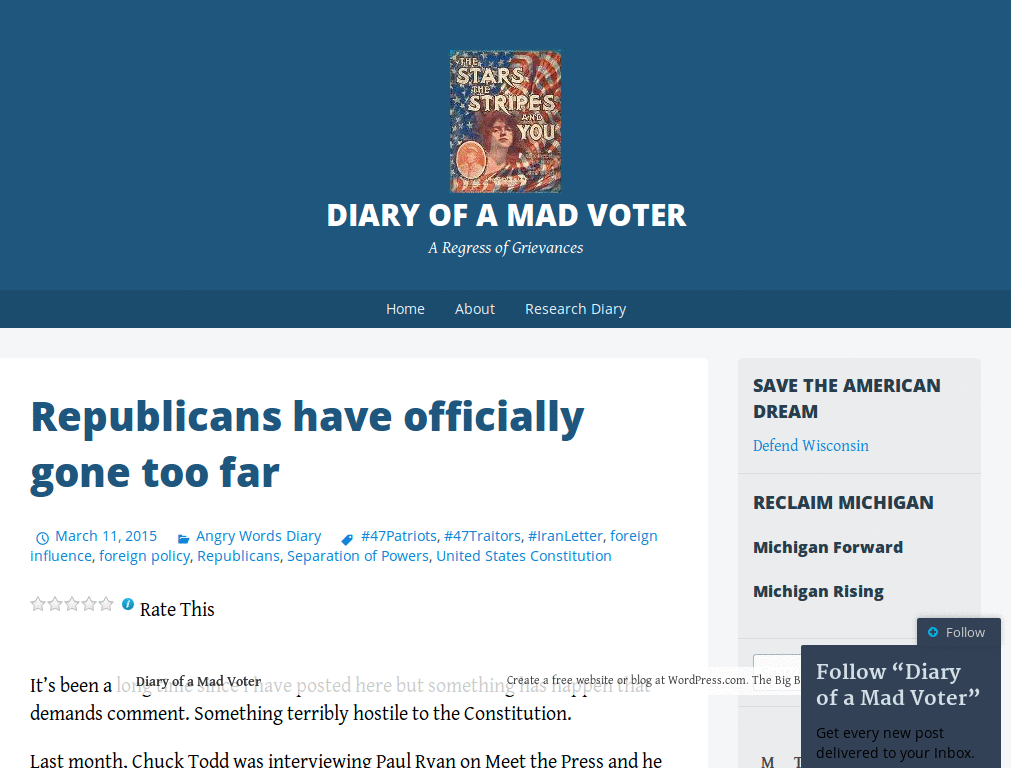
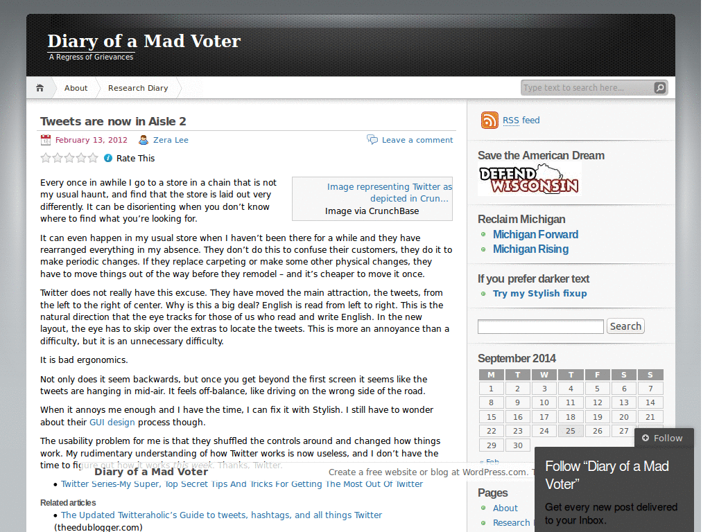
Mad Voter Diary (wordpress) Dark Text
0
Wordpress
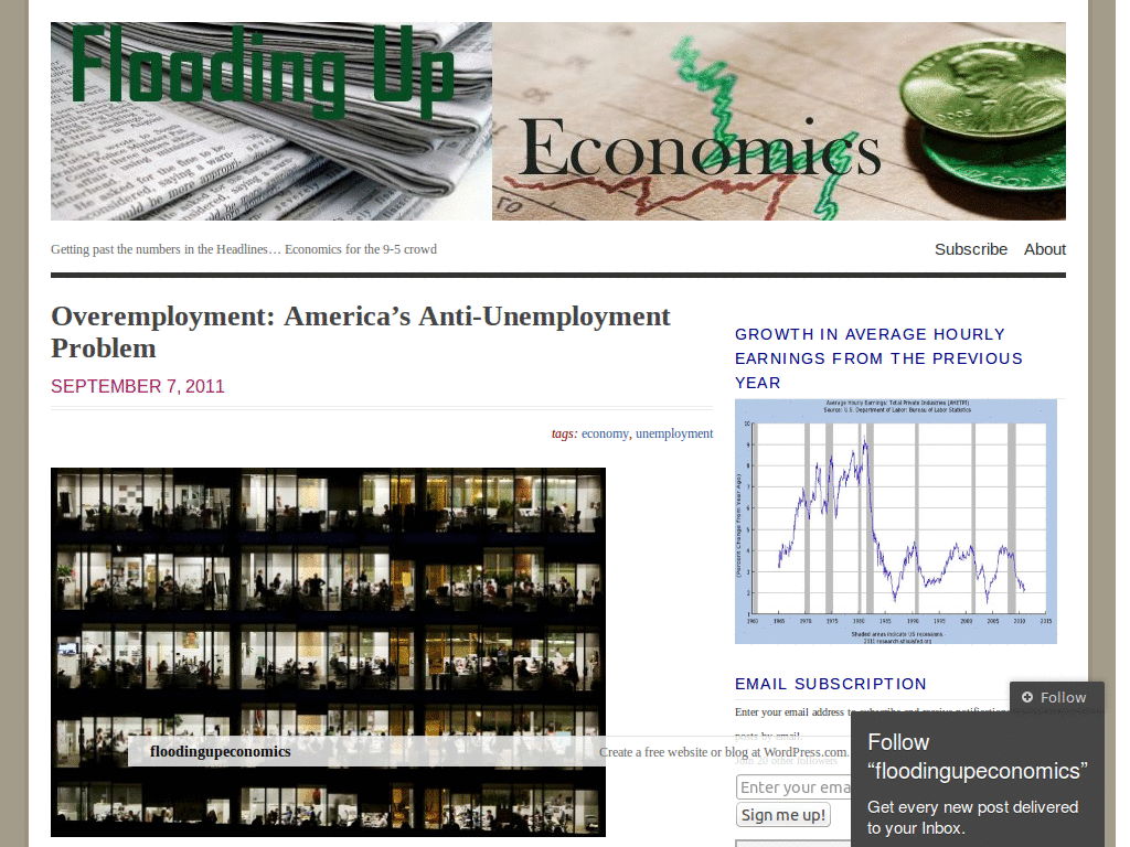
FloodUpEconomics - DarkText
0
Wordpress
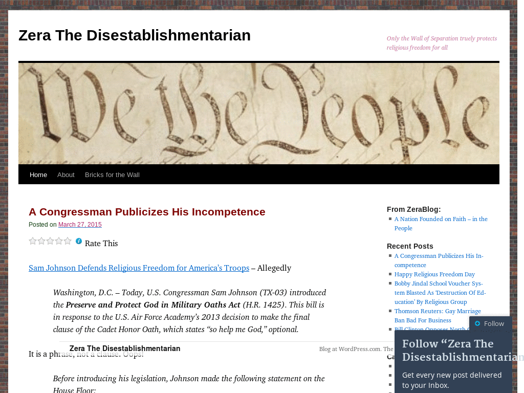
Zera The Disestablishmentarian - Darker text
0
Wordpress
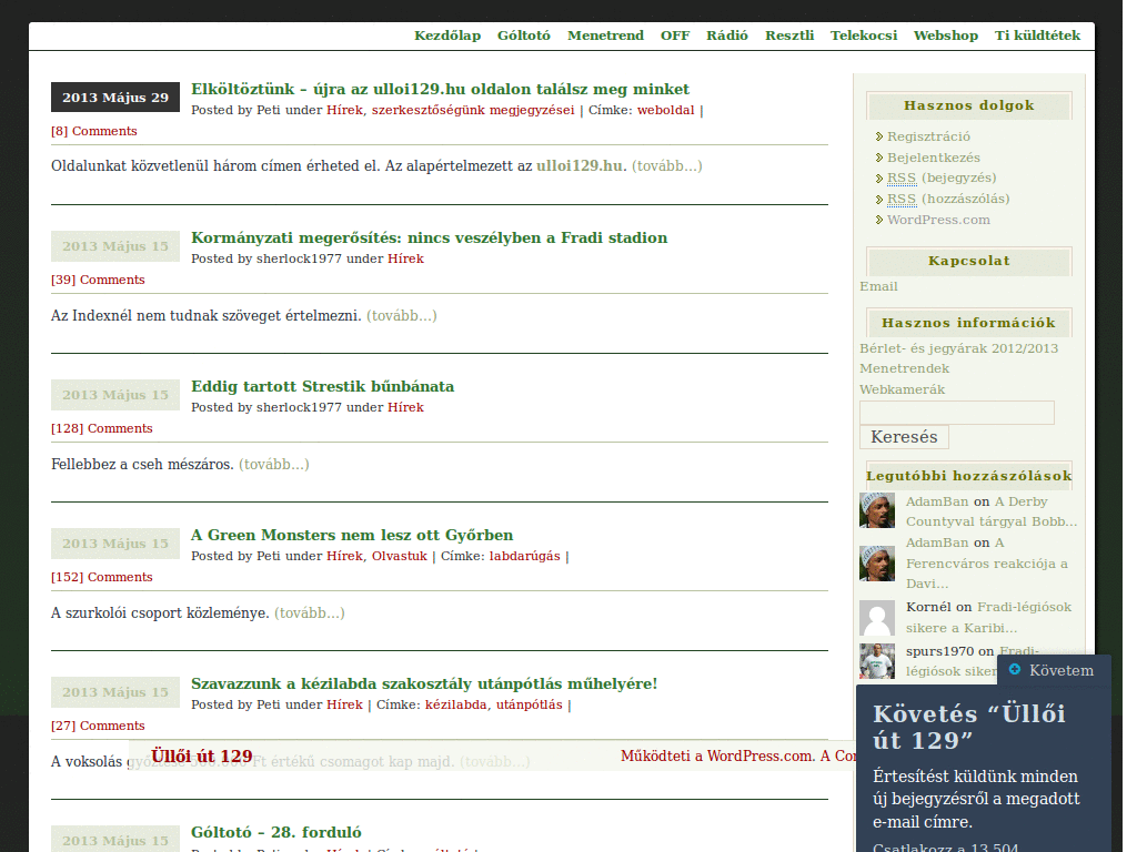
Üllői 129
0
Wordpress
Modifica el editor del Carnicero
0
Wordpress
Wordpress -- Fixed menu (Admin Panel)
0
Wordpress
WordPress Annoyances
0
Wordpress
Print WordPress Codex
0
Wordpress
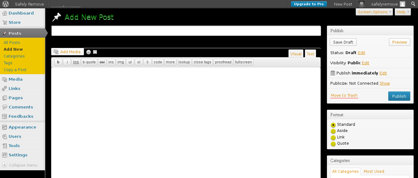
Wordpress Admin Alternate (Black/Orange/Green)
0
Enjoyin' Stylish?
Rate Us
thanks
rateStylish
What`s wrong?
Style not working
Too complicated
There`s a bug
Inappropriate content
Did not find what i was looking for
Submit Feedback