Create Style
What are we styling?
All
roblox
youtube
google
discord
spotify
pinterest
whatsapp
facebook
instagram
yandex
vk
twitter
netflix
pokemonshowdown
tumblr
openai
wikipedia
reddit
fandom
amazon
baidu
Most popular Ebay Themes, Skins & Backgrounds
Style Ebay with custom Ebay themes! Change the background, color, schemes, fonts, and more! Share your own themes for Ebay too!
Ebay
3.9
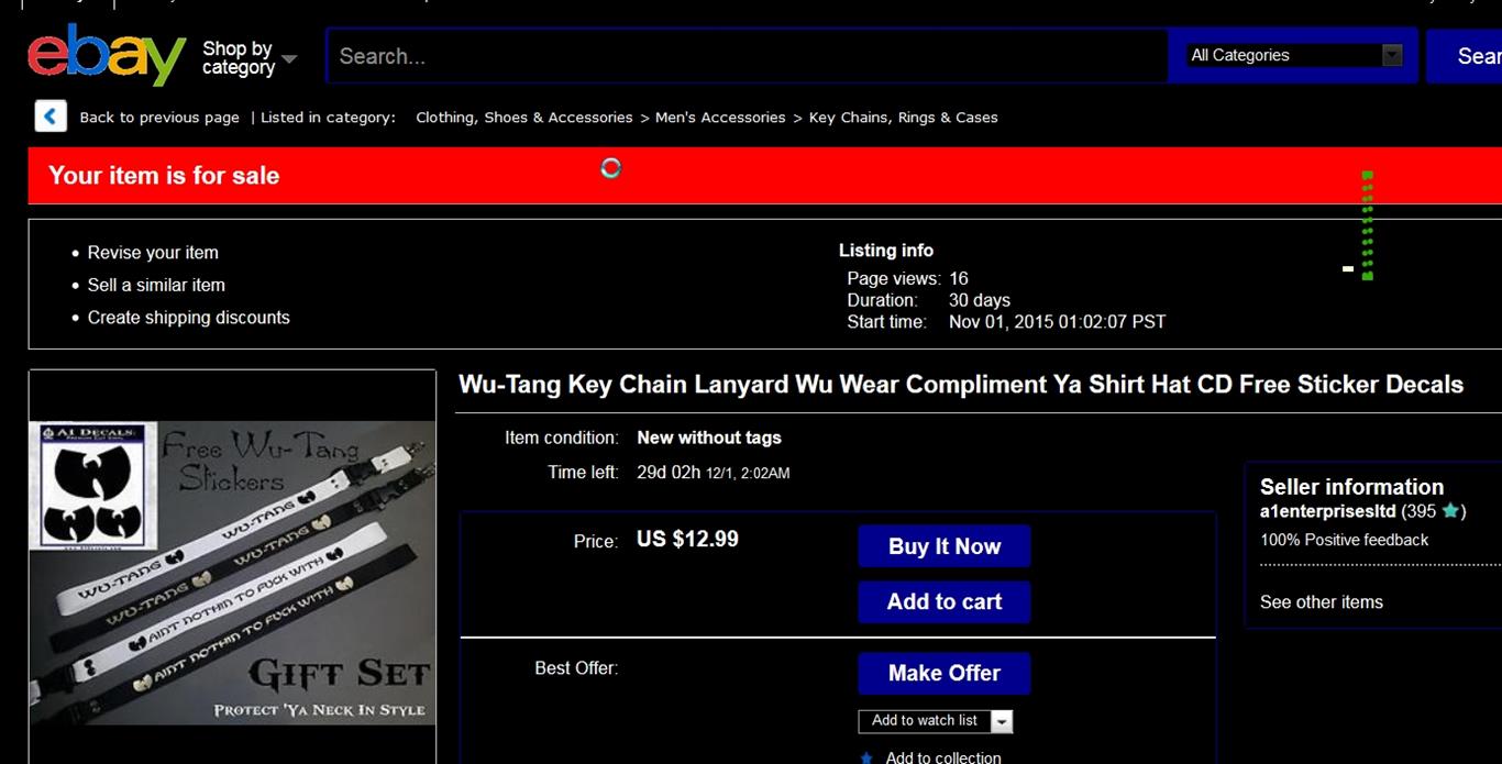
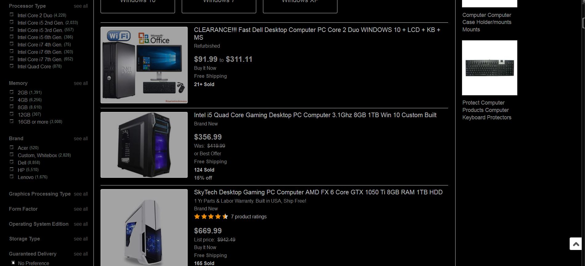
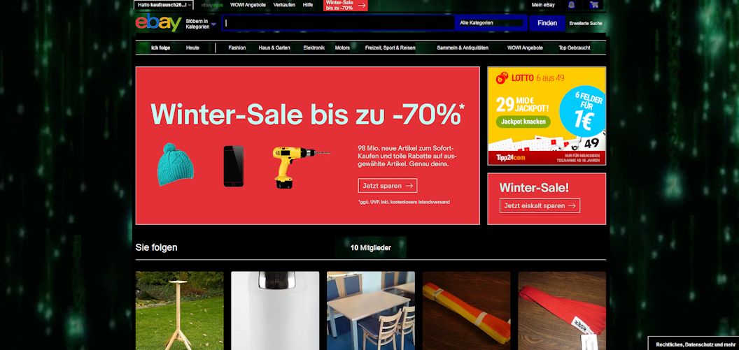
eBay // Carbon v1.0 [BLACK] [DARK MODE]
3
Ebay
3.9
eBay Dark Black Midnight Smacked
3
Ebay
3.6
eBay: Fix <font> tags (Updated: 2007.03.05)
0
Ebay
3.7
Doom Ebay
2
Ebay
3.7
EBay - Bayofblack
0
Ebay
3.5
Ebay Dark Black
0
Ebay
3.5
The Dark and Flat - eBay
5
Ebay
3.5
eBay Clean and Wider
7
Ebay
Ebay Black & Grey
0
Ebay
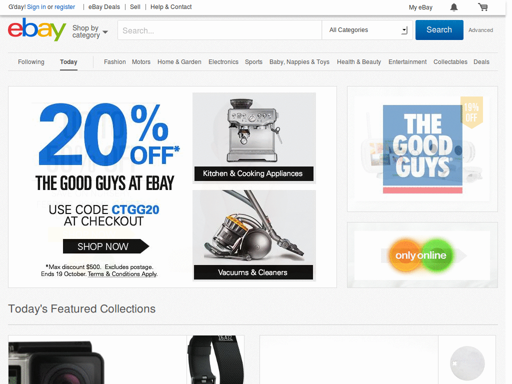
BM Ebay - AUSTRALIA
0
Ebay
ebay hilight new things
0
Ebay
† eBay Advertisement Remover †
0
Ebay
eBay clutter free 2016
0
Ebay
EBAY | DARKNESS
0
Ebay
eBay.com No Ads
1
Ebay
Ebay dark theme matrix rain animated
0
Ebay
Simple eBay Home
0
Ebay
† eBay Remove All Clutter †
0
Ebay
ebay AU Cleanup
0
Ebay
Saved Searches - Me only
0
Ebay
ebay font fix
0
Ebay
myBayBay
0
Ebay
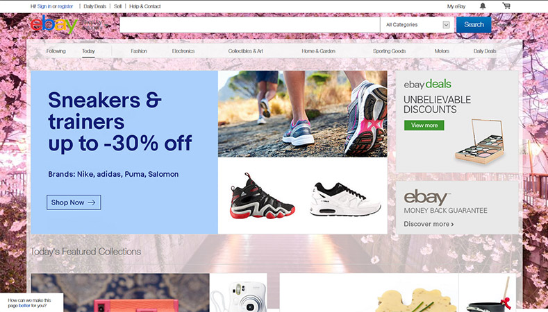
Ebay Cherry Blossom
0
Enjoyin' Stylish?
Rate Us
thanks
rateStylish
What`s wrong?
Style not working
Too complicated
There`s a bug
Inappropriate content
Did not find what i was looking for
Submit Feedback
![eBay // Carbon v1.0 [BLACK] [DARK MODE]](https://userstyles.org/style_screenshots/202036_after.jpeg?r=1781046033)